

![Improve Your Data Presentation Skills With These 6 Tips [Infographic]](https://blog.soliditech.com/hubfs/Improve-your-Data-Presentation-Skills-with-these-6-Tips--Infographic---UPDATED_Updated-2023.png)
As increased importance is placed on data, human attention spans are shrinking (to 8 seconds or less according to the NY Times). This means that in order to deliver a killer data presentation (and grab that next promotion) you need to learn to turn raw data into a relevant, appealing, relatable and memorable presentation.
Working with an automated business solution means you're surrounded by great dashboards and reports built on integrated software. This increase in data visibility means more complicated analysis and thus more meaningful results.
To deliver a great presentation, you want people to understand what you’re saying, and be impressed, without them having to think about it too much. [Is that all?]
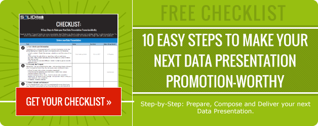
Improve your data presentation skills with these 6 tips:

1. Double check your data: Rubbish in, rubbish out
Check and double check. Conclusions and recommendations built on inaccurate data will damage your credibility and result in bad business decisions.
2. Be clear about your objectives
Be very clear about what you are trying to achieve with your data presentation; A promotion? More budget? A monthly report back? Be factual and be relevant. Have clear and obvious links between analysis and conclusions and bring your conclusions together in a meaningful way to achieve your objectives - don’t be sidetracked by unnecessary numbers.
3. Tell a story: Understand your audience
Understanding your audience is key to telling the right story. If you’re asking for a promotion, tell a story about how your work has directly affected the business. Include the details you know your boss will pay attention to.
Don’t be afraid to inject personality into your presentation too. Skills You Need and Lifehack have some great presentation delivery tips.
4. Use visual representation
Numbers are boring. Reams and reams of numbers even more so. Use relevant visual representation, icons and images to support your story, it brings impact and makes the key takeaways more memorable. Canva is a great free tool that will help you quickly and easily build some awesome graphics. Freepik also has a great image repository. Visme have produced a blog titled "100+ Creative Presentation Ideas That Will Delight Your Audience" - this is also full of great ideas.
5. Choose the right chart
When you do want to use a chart, make sure you pick the right one. Visage says “Nothing hurts your credibility—and your message—more than misrepresented data”. Allow for easy comparisons and order data sets in a logical hierarchy. This is about making the data you’re presenting easy to read and understand.
6. Keep it simple
Don’t clutter the page, use great colours , highlight key points to make them obvious and use fewer words and more graphics.
Keep it simple, keep it clear, keep to your objectives and you’ll have a 5 star data presentation in no time.


Comment