


When you’re standing in front of what feels like a stadium full of people with your data presentation ready to go, sometimes picturing everyone in their underwear is not enough. Business news daily claims that the number one soft skill in the work environment is good communication, so there is little you can do to avoid having to speak to a group of people at some point in your career.
Even worse, according to Huffpost we lose up to 75% of information thrown at us on a daily basis. So you could go to all that effort, only to have 75% of what you say immediately forgotten. Not good. Especially when you’re trying to nail that next promotion.
Ace your next presentation (and make sure you stay memorable) by following our handy checklist below; you can even download an interactive version here. We’ve run through the process from beginning to end and included a bunch of tips to help you prepare for the big moment.
“Spectacular achievement is always preceded by unspectacular preparation.” - Robert H. Schuller.
How to Build a Promotion-Worthy Data Presentation: A 10-Step Checklist
Before your Presentation
1. Fact-check your information
Standing in front of management with incorrect information is not only embarrassing but makes you seem unprepared and unprofessional. Ways to check your data:
- Verify content: Check the sources, calculations and the dates of the data.
- Ensure that the calculation or reporting methods used were accurate. Take random samples across the data and check whether they are correct.
- Use various sources and different media in order to get an overall, unbiased view.
2. Present, don’t report
Remember, you are presenting the data - not reporting it back. Prove to your management team that you can easily relay complicated data.
- Give Context: Why is this information important?
- Summarise the statistics and information, rather than simply reading numbers from a list.
- Have a handout ready: If you have too much data, provide a handout for the team to read through. This will also help to keep your slides balanced and uncluttered.
- Practise, practise, practise.
3. Keep it simple and balanced
If it is complicated for you, it will be complicated for those listening to you. You don’t want people to lose focus during the crucial moment of your delivery.
- Keep a good balance of text and visuals.
- Don’t overcrowd your slides- just a couple of points per slide is enough.
- Stay away from jargon. People will lose interest if they cannot understand what you’re saying.
4. Use visuals
Instead of having pages of numbers and statistics that don’t make sense to anyone, why not present them in a visual format? According to an article on Linkedin, 10% of your audience will remember verbal notes, while 60% will remember visual content.
- Use Colour to get people’s attention. Keep it to colours people can see easily (avoid yellows that may be too light to see from afar).
- Go the Distance: Make sure people can easily read or see the text and visuals from at least a few meters away.
- Canva is a great (free) platform to get creative with visuals.
5. Stack and compare
The numbers may look pretty but what do they mean? You may have good statistics, but if there is nothing to compare them against your team may never find out whether the company has made progress or not.
- Limit the number of comparisons from previous months, as it may get confusing with too many on a single chart.
- Only show important and relevant statistics.
- Set a goal line. This allows the team to see whether their improvements are meeting the goals that have been set out.
- Choose the right chart. To depict a comparison, one type of chart may be better suited than another. Hubspot explains which types of charts are best suited for each type of data.
6. Time yourself
Check yourself the night before your presentation to make sure you don’t run over time on the day. For example, if you have a 10-minute presentation, know what you should have covered by minutes 5 and 8, so you can track your progress.
- Know how much time you have. You can therefore plan your presentation accordingly.
- Plan your presentation with mini goals: Set time goals for yourself to reach at specific sections of your presentation. This will ensure you stay on track.
- Practise, practise, practise.
Before your Data Presentation
7. Arrive early
Arriving early allows you to set up without being rushed. You can also make sure that your data presentation works.
- Scope out the room so you feel comfortable in your surroundings and make sure that your audience will be comfortable too (i.e. there’s enough seating if required, your presentation is visible, air conditioning is not too hot/cold).
- Check your tech gadgets. Make sure that your devices are properly connected and that the slides of your presentation actually work.
- Look good (promotion-worthy) in front of your management team and be ready and waiting when they arrive. This will boost your confidence before you even begin.
8. Make eye contact
Part of looking confident, competent and authoritative (all promotion-worthy qualities) is making sure you make eye contact with your audience. According to Inc., when you have eye contact with your audience, they are more likely to look and listen to you and your core message.
- Be random. Don’t make eye contact systematically from left to right - it will seemed forced. Keep eye contact random and scattered around the room.
- Don’t stare. Making eye contact with someone for too long could make an audience member feel uncomfortable.
- Focus on your audience’s foreheads. If you really struggle to make eye contact with your audience, look at their foreheads rather. It will appear that you’re making eye contact.
9. Focus on the core message
Focus on a single, clear message that should follow throughout your presentation.
- What should your audience remember? What is the most important piece of information that your audience should remember? Keep this in focus throughout your presentation.
- Be consistent. Make sure your key focus is in the introduction (what is your focus), body (explain your focus) and conclusion (how does this affect your audience).
10. Don’t forget to breathe, and smile
Take deep breaths before, during and after your presentation. This will not only keep you calm but also help you pace yourself.
- Taking large breaths before and between sections of your presentation will help you set a good pace; you don’t want to go too fast or slow down too much.
- Pause for effect. These “golden silences,” allows your audience to take in what you have just said. It allows you to take charge of the room and get the audience’s attention.
- Nervous? Breathing exercises may help to calm you and give you more confidence.
Improving your data presentation skills, along with this checklist to keep you focused, will have you at the top of that promotion list in no time!
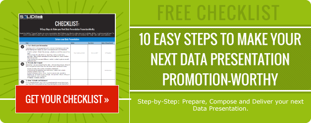
Image Credit: Freepik

![Improve your Data Presentation Skills with these 6 Tips [Infographic]](https://blog.soliditech.com/hubfs/Improve-your-Data-Presentation-Skills-with-these-6-Tips--Infographic---UPDATED_Updated-2023.png)


Comment