

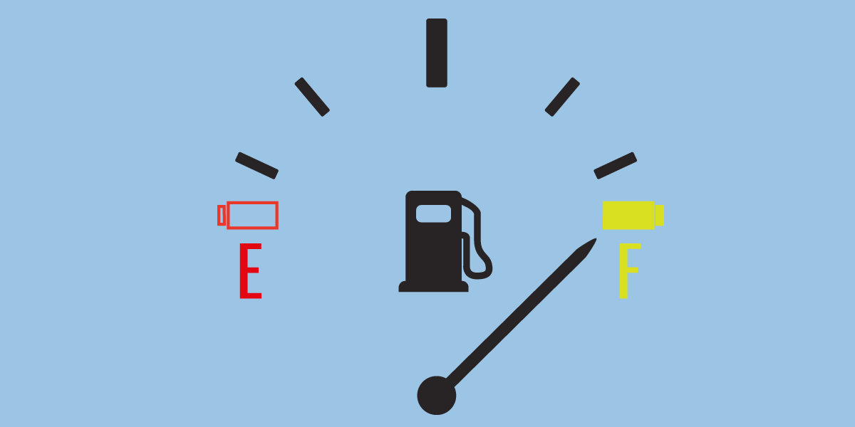
Next time you mundanely plonk your cheeks down on your car seat, don’t just mindlessly look out into the distance. Take note of what’s right under nose. A warning light that flashes when your engine is too hot, another one reminding you that your oil is low, a sign stating that your car’s battery is short of power…
This is your car’s dashboard. It displays a set of visual cues that show the current status of your car. Enter the business intelligence dashboard. This holds the same function as your car’s dashboard, except it is a visual guide to your business. In other words, it is a bunch of pretty pictures that tell you if your business operations are going according to plan.
Ain’t that fancy? Well, it is more than just fancy. If used correctly, dashboards can provide essential information, in real time. Just as the fuel gauge saves you time and money by telling you when your fuel is low, so a dashboard can tell you vital facts, such as when your sales reach critical numbers. So, how can business intelligence (BI) dashboards help to improve your business?
Setting the scene...
To begin with, here are two great definitions. A BI dashboard:
Is a data visualisation tool that displays the current status of metrics and key performance indicators (KPIs) for an enterprise (Source: TechTarget).
Provides preconfigured or customer defined metrics, statistics, insights and visualisation into current data. It allows the end and power users of BI software to view instant results into the live performance state of business or data analytics (Source: Techopedia).
You can see a common thread here, right? The key focus is on instantly viewing key data for the benefit of an enterprise.
Now, let’s get acquainted with the term business intelligence. Dashboard Insight can help us out with a short definition:
Business Intelligence is turning data into knowledge to support informed decision making.
Aha! So, the dashboard is the technology that makes this data available in a meaningful way. Meaningful data helps the analyst make informed decisions. These decisions can only be made if communicated correctly. If the best way to align your daily activities with your company's goals is through effective communication, then the BI dashboard is your magic wand to effective business intelligence.
But why is the dashboard such a magical tool for business intelligence? Well…
1. Dashboards allow for easy access to heaps of data sets
Dashboards allow for intuitive, easily observable access to information. Time is money, we all know this, but what many business executives don’t understand is that even a small change in operations can save drastically on time. Imagine how long it would take to gather and compile information by hand, sifting through endless reams of paper; or even manually through thousands of emails. Business Intelligence dashboards are automated and instant.
2. Dashboards are customisable
They are not only tailored for specific departments, but can also be used on various platforms; such as desktop, mobile and web/cloud users.
In order for dashboards to improve ROI, they need to be tailored for a specific role within a company. Every department can customise their dashboards to suit their specific points of interest and KPIs:
- Sales. Shows what is driving sales, such as the funnel, latest opportunities and sales tracking. Every aspect of the sales be processed in one location.
- Marketing and Social Media. Tracks progress of a campaign, quantifies ROI of marketing efforts, allows for daily reports and current data to base on hard evidence. Tracks all social media details to improve brand awareness.
- Project Management. Updates project status and tracks upcoming tasks, completeness and expenses.
- Operations and Administration. Keeps track of server KPIs, sets alerts to notify of important information.
- Customer Support. Structures tickets in a clear and easy-to-understand manner. It can provide a strategic and analytic view of a team’s performance, to stay ahead of issues. Also allows for great support, for improved customer satisfaction. To see other ways to stop annoying your customers click here.
Tip:Just because dashboards are customisable does not mean you need to use every single display at once. More choices do not necessarily mean better visualisations. Oh, that bar chart is colourful. But wait, what about that sleek heat map. Oooo, I need a bullet chart… Using too many displays could result in a mind boggling dashboard with just too much information. For a look at how to successfully build and manage your dashboard read this awesome article by the president of WiseAnalytics, Lyndsay Wise. |
3. Dashboards are more than just performance indicators
Dashboards are not just performance scorecards. They, like a car dashboard, show real time data rather than how information has changed over time. But you can show this information if needed to create what is known as a scoreboard. Dashboards are therefore quite flexible.
You can use programs like Leftronic, Sisense and Cyfe to display relevant data, such as Google Analytics, in real time to have a clearer understanding of your customer’s behaviour.
Dashboards are also interactive, meaning they allow various members in a group access to a dashboard. Executives can look at all functions of their business, while personnel can switch between different views of data to access exactly what they need.
4. Dashboards allow ease of reporting crucial information
Dashboards pull data from various sources into a visually appealing display. Anyone from your Aunt Ethol to your techie CEO Billy Jobs will understand the correct information clearly and effectively. The data displayed will depend on the user. So, you will need to categorise your dashboard accordingly, for example, will you need to show qualitative or quantitative information? Will it be a vertical or lateral display?
Most good dashboard software now alerts users by notifying them of fluctuations on device of their choosing. Not in the office? That’s okay, just download the app.
How to create a killer BI Dashboard
Okay, so you know all about dashboards and their functions, but now what? How do you create an intuitive dashboard with immediate access to information, without being overwhelming and complex?
Victoria Hetherington and Tom Kawamoto writing for Dashboardinsight come to the rescue with these key elements to creating an effective dashboard. Dashboards should:
- Communicate with clarity. It should be easily accessible, quick to access important data, and visually compelling. Simplicity is key. Plan your dashboard with patience and in advance.
- Have minimal unnecessary distractions. No matter how interesting the feature may be, avoid adding unnecessary data that could cause confusion.
- Obtain buy-in from executives. Dashboards are created to organise business information so that they support meaning and usability. They are not only created to improve business functions, but should also be maintained by high-ranking executives. Once the person in power shows a lack of interest, so will the rest of the team.
- Apply the latest understanding of human visual perception to the visual presentation of information. Think about how Google used to look as opposed to its visual presentation today (here’s a nice video to kickstart your memory). As design methodologies change and we understand how people view information, so you should upgrade the visual design of your dashboard. Remember that they are not static and rigid, but malleable. So make it pleasant to look at!
- In a word, simplicity is key. If it doesn’t need to be there, don’t put it in. If you are CEO, for example, a strategic dashboard that shows an overall view of what is going on in the company would most likely be your best bet. Data analysts may select an analytic dashboard that compares data sets, so they can dig deeper into root causes of issues. A real-time, operational dashboard would suit operations or project managers, so they can see what is happening right now!
6. Automation and dashboards go together like macaroni and cheese
It goes without saying that effective dashboards are a major part of any automation system. Automation and dashboards go together like macaroni and cheese, great on their own, but magical together.
Dashboards use automation to gain access to data and automation uses dashboards to explain this essential data.
This is why any great automation system would include the option to create a personalised dashboard. Imagine having brilliant data that’s lost somewhere in the system. That’s no help to anyone. It needs to be easily accessible and visually impressive.
What do dashboards even look like?Keen to see a dashboard at work? Check out Sisense’s demo. Just click here and then on Open Dashboard. If you’re a visual person, here are some ideas for personalising your dashboard. Stuck on what software to get? This Dashboard Software Buyer’s Guide will help steer your decision. And just for fun, take a look at this article from Yellowfin if you’re craving to know even more about BI dashboard best practices (there’s a pretty cool link inside to a dashboard on the Olympics). |
Now that you now all there is to know about dashboards, create one for yourself. Once you’ve tinkered around, why not try utilise it in your business. There are many ways that dashboards can help to improve time and efficiency in your business, if used correctly. So get cracking and start visualizing your way to success!

![Improve your Data Presentation Skills with these 6 Tips [Infographic]](https://blog.soliditech.com/hubfs/Improve-your-Data-Presentation-Skills-with-these-6-Tips--Infographic---UPDATED_Updated-2023.png)

Comment